typeface
noun typeface
ˈtaɪpfeɪs
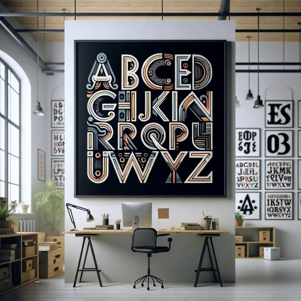
A specific design of printed letters or characters
The designer chose a bold typeface for the headline.
typeface
ˈtaɪpfeɪs
読み込み中…
ˈtaɪpfeɪs
A specific design of printed letters or characters
The designer chose a bold typeface for the headline.
ˈtaɪpfeɪs
The style and size of the characters used in printing text.
You can change the typeface in the document settings.
音声を読み込めませんでした。しばらくしてからもう一度お試しください。
A typeface is a set of letters, numbers, and symbols that have a similar design. It is used in printing or digital media to display text. For example, Times New Roman is a typeface, and Arial is another typeface. It is important to choose the right typeface for the material you are using to ensure it is legible and easy to read.
Calligraphy refers to the art of writing letters or words in a decorative, stylized way using pen or brush.
Calligraphy is a form of hand-lettering while typeface is a computerized set of letters used for printing or on screen display.
単語を開く: Calligraphy →Character refers to a single letter, number or symbol such as 'A' or '#'. It is applicable in writing or typing, where each individual character is used to create words, sentences and paragraphs.
Typeface refers to a set of characters that have a consistent design and style. It is applicable in the field of graphic design or printing, where specific typefaces are chosen to create a particular visual effect or aesthetic.
In simpler terms, a character is a single letter or symbol, while a typeface is a collection of characters with a chosen design and style.
単語を開く: Character →Font refers to the specific size, weight, and style of a typeface, whereas typeface refers to the overall design of the characters, including the shape, width, and overall style.
In simpler terms, a typeface is like a family of related designs for letters and other characters, while a font is like the individual member of that family with specific variations.
For example, Arial is a typeface, whereas Arial Bold, Arial Light, and Arial Narrow are different fonts within that typeface.
In practical terms, designers and typographers use the terms interchangeably, but technically, a typeface refers to the overall design, and a font refers to a specific version of that design.
単語を開く: Font →A letter is a single character that represents a sound or meaning in a language, such as 'a' or 'b'.
A typeface is a specific design of letters, numbers, and symbols that make up a complete set of characters.
Letter is applicable when referring to an individual character, while typeface describes the overall style and design of the complete set of characters used in a document, such as a font or a family of fonts.
For example, 'Times New Roman' is a typeface that includes uppercase and lowercase letters, punctuation marks, numbers, and symbols.
The letter 'a', as part of the 'Times New Roman' typeface, would have a specific design that fits with the overall style of the font.
A letter is a single character, while a typeface is a complete set of characters with a specific design style.
単語を開く: Letter →A script is a style of writing with specific characters and strokes used in handwriting or calligraphy. It refers to the way letters are written, usually in a cursive or decorative manner.
Scripts are applicable in invitations, formal documents, and other artistic forms like movie scripts.
The key difference between script and typeface is that script refers to the specific style of handwriting, while typeface refers to the overall design of the characters used in printing or digital media.
単語を開く: Script →Matthew Carter: My life...
YouTube で見る ↗I think a lot of people overlook the importance of the menu as a marketing tool and a way of communicating to the customer what the ambition of their restaurant is. Not only the typeface and the design, but what is it printed on? Is it cheap-looking? Is it the right kind of paper for that restaurant?
A coherent typeface is an essential part of a coherent branding strategy.
The design of 'Love Actually,' the typeface, the basic line of that poster and that DVD cover has been ripped off so many times.
A good typeface is like a well-crafted English or Italian suit: it always looks perfect.