ऑडियो लोड नहीं हो सका। कृपया बाद में फिर कोशिश करें।
उपयोग कैसे करें
Typography refers to the art and technique of arranging and designing written or printed text. It includes selecting appropriate fonts, sizes, colors, and layouts to make the text easy to read and visually appealing. Typography is used in various fields such as advertising, publishing, graphic design, and digital media. It helps to enhance the message, communication, and branding of a product or service.
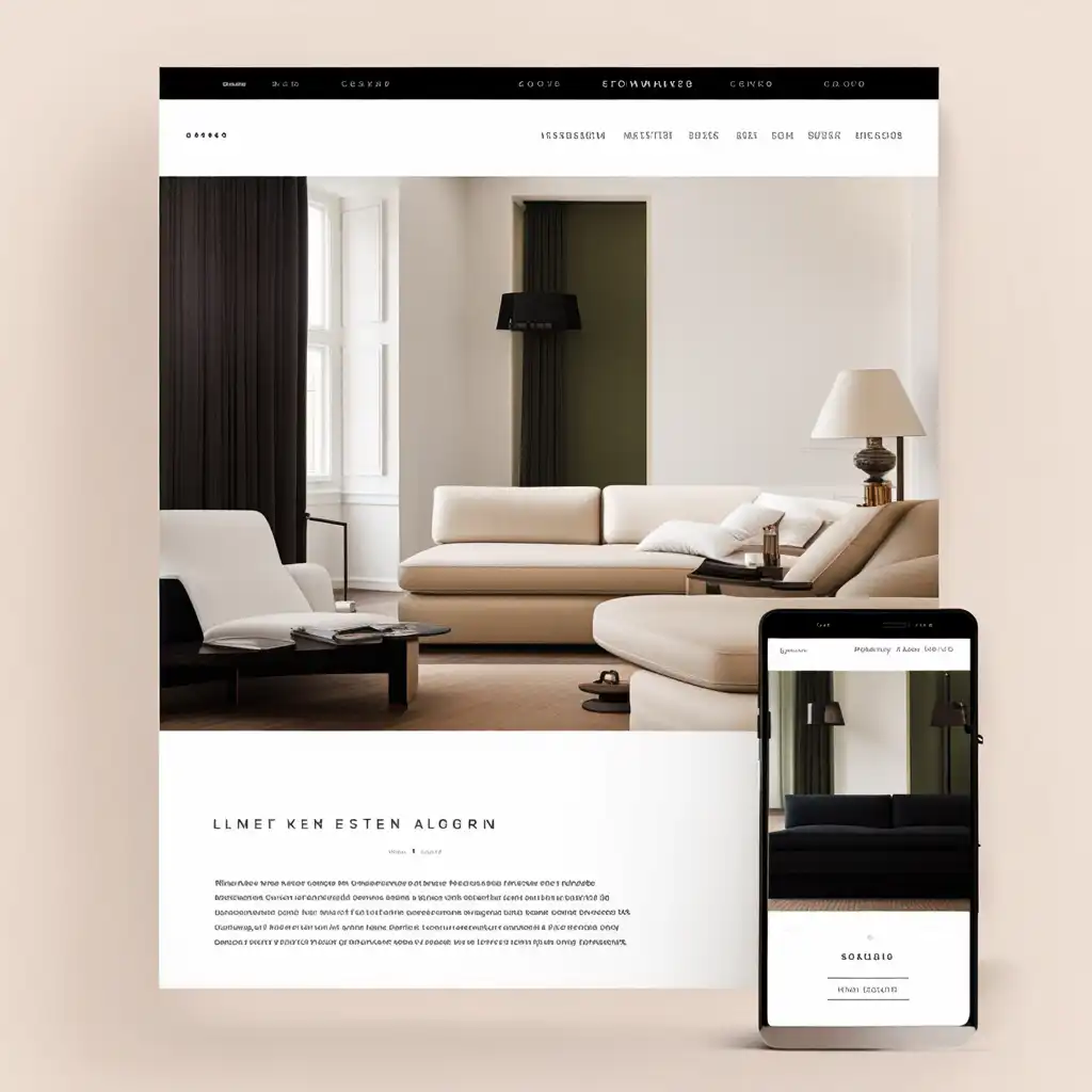
Composition refers to the arrangement of visual elements such as text, images and shapes. It involves deciding how to position and organize these elements on a page or in a design.
Both composition and typography are applicable in graphic design, advertising, printed materials like magazines and newspapers, and web page design.
However, composition is more generalized and can apply to any element in a design or layout, while typography is specific to text.
Design refers to the process of creating something visually appealing and functional.
It can be applied to various fields such as graphic design, architecture, fashion, and industrial design.
Typography specifically refers to the design and arrangement of typefaces (or fonts) in a visually pleasing way.
It is often used in graphic design, advertising, and publishing industries to communicate information effectively.
Design is a broader term that encompasses various creative fields, while typography is a specific aspect of design that deals with fonts and the visual arrangement of text.
Font refers to a specific style or design of a set of characters, such as Times New Roman or Arial. Typography encompasses the overall design and layout of text on a page, taking into consideration factors such as font choice, spacing, and formatting.
Essentially, font is a part of typography, but typography is a broader term that includes the entirety of how text is presented.
You can apply font when selecting a style for a specific set of characters, while you can apply typography when designing a document or webpage to create an overall aesthetic and make text readable and engaging.
Layout refers to the arrangement of visual elements in a design, such as text, images, and graphics. It is about organizing and structuring the content in a logical and aesthetically pleasing way.
Both layout and typography are important aspects of design, but they serve different purposes. Layout focuses on the overall design structure, while typography focuses on the visual appearance of the text.
Print refers to the act of producing material on paper or any other physical surface using a printing press, copy machine or any digital print technology.
In simpler terms, print refers to the physical output of text and images, while typography is concerned with the design and layout of the text itself.
Print is used when making physical copies of documents, books, posters or other materials. Typography is used in designing logos, advertising materials, digital media, and other forms of visual communication.
Print is what you can touch and hold, while typography is the style and design of the text.
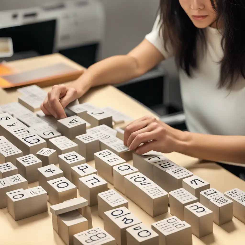
Typesetting refers to the process of arranging text, images, and other content in a document or publication. This includes deciding on the font, font size, line spacing, and other layout considerations.
Typesetting is applicable in the context of creating books, newspapers, magazines, and other printed materials.
Typesetting is the technical aspect of arranging text while typography is the artistic aspect of designing text.
I learned about serif and san serif typefaces, about varying the amount of space between different letter combinations, about what makes great typography great. It was beautiful, historical, artistically subtle in a way that science can't capture, and I found it fascinating.
Lyric poetry is, of course, musical in origin. I do know that what happened to poetry in the twentieth century was that it began to be written for the page. When it's a question of typography, why not? Poets have done beautiful things with typography - Apollinaire's 'Calligrammes,' that sort of thing.
We have thought carefully about how our use of typography, colour, and images can support and enhance 'Guardian' journalism. We have introduced a font called Guardian Headline that is simple, confident, and impactful.
I was always fascinated by graphic art and typography and architecture. And so I was constantly cutting things and making blocks and making buildings out of shoeboxes.
Copy, art, and typography should be seen as a living entity; each element integrally related, in harmony with the whole, and essential to the execution of an idea.